
CONNECT Home Page - 12 Month Trend
On the home screen, you might have noticed you have a line graph that shows a "12 Month Trend". This graph will give you great insight into how your community is performing month over month. For an in depth description on the graph, see below.
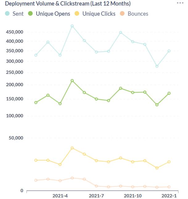
The 12 Month Trend graph shows you how your community is performing month over month. The 3 metrics it uses to depict your performance are open rate, click rate and unique click rate. An average for each metric is calculated by combining all of the deployments for that month and averaging the rate. Below you'll find a description for each element of the the graph.
- Percent - The Y axis of the graph uses a percentage value that changes based on the the largest value in the graph.
- Value - By hovering over an intersecting point on the graph, you can see the exact value and which month and metric it applies to.
- Months - The X axis of the graph displays each month that it has a value for. If you have been in CONNECT less than 12 months, it will only show the months you have actually deployed.
- Updated - The data that the graph uses is updated on a daily basis. The "Updated" date/time stamp provides insight into when the data for the graph was last updated by the system.